Discovering a huge demand for Kid’s Activities
“Kid’s activities” was one of the most top searched terms on Groupon and we didn’t have a consumer experience in place.
We knew this was a problem because analytics revealed the search volume was highest among our most searched phrases. Groupon was missing out on a major revenue opportunity because we did not deliver a relevant experience and did not have enough supply. The goal of this project was to reimagine the kid’s activities experience to help inform the overall product strategy.

Uncovering key insights from research
I spoke with our UX research team to learn about what research has already been done and discovered prior qualitative research was conducted with mothers.
This research revealed a few key insights:
- Can’t get inspired – Mothers did not know what types of activities were available. If she didn’t know exactly what he was looking for, browsing by endlessly scrolling was not helpful.
- Can’t make an informed decision – When an activity was found, there wasn’t enough information to help her make a decision. Things such as age range, date, cost, hours, seasonality, booking etc.
- Can’t trust Groupon – Mothers wanted to see reviews and opinions from people who have actually completed the activity. They need validation that this activity will be a good purchase.
User Quotes
``I want to do things with my kids, I don’t want to always sit and read a book while they are jumping. I’d like to see museums & community/cultural events.``
``With 3 kids I am looking for things to do seasonally, for birthdays and holidays``
It would be so cool to see age appropriate stuff and stuff for free or this weekend, in the moment type stuff.
Improving discovery to inspire users
As you can see from the search results, the existing Groupon experience doesn’t help mothers find things to do.
As the sales team worked to expand the supply side, I explored opportunities to improve the discovery experience helping user’s achieve their goal.
How might we make discovering kid friendly activities easier and accessible for mothers?

Ideation without constraints
My product manager encouraged me to think outside the box and not to get tied up with matching the current look and feel of the app. She was really looking for ideas that did not resemble the traditional Groupon experience. With a large constraint removed, I sketched a variety of ideas that explored different ways to browse. My goal was to minimize the amount taps needed to obtain the necessary information about an event.

IDEATION SKETCHES
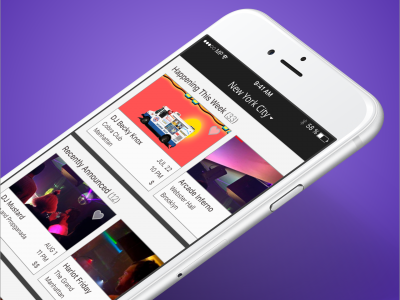
I explored redesigning the search results page to include more detail, introduce filters, and swipeable cards to improve discovery.

THINGS TO DO LANDING SCREEN

SWIPEABLE DISCOVERY CARDS

THEMED COLLECTIONS
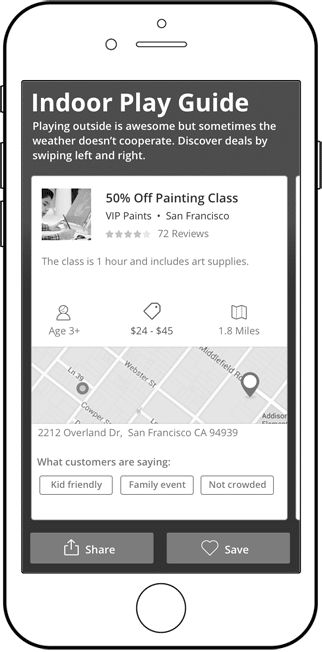
As I was redesigning the discovery experience, I realized that there was too much information to include in a preview mini card. I decided to reduce the clutter in the preview and move key details to the detail page.
Prioritizing information to help users make an informed decision
I restructured the event detail page because I wanted it to be clear and concise. When a user is looking for an event/activity, there is a lot more information required in order to make a decision. I prioritized the key information that would affect a mother’s decision to book a kid’s activity based on user research.
Key details that impact purchasing decision:
- Cost
- Age appropriateness
- Quality

Event Details
Adding key details in the event information such as parking, food, tips helps build credibility. We want to be transparent and list everything the user needs to know so they don’t have to leave our app and do their own research.

User Reviews
Incorporating user generated content highlighting parent’s prior experience at the event gives unbiased opinions. Reviews are listed for those who have time to go in detail, but I wanted to a quick and easy summary for busy moms. The most used keywords are aggregated together, which helps users identify if this event is a good fit.

High Fidelity Mockups

FINAL MOCKUPS
Result
The mockups were presented to stakeholders helping to inform next phase of the product road map.
I presented my ideas to the my product manager and she was really pleased with my solutions. Particularly, redesigning the deal detail page to include more pertinent information that helps parents plan for the event. She also liked my idea to include a review highlights that uses common phrases from reviews to offer quick summary of people’s thoughts. I ended up speaking with another product manager on the User Generated Content team to further discuss the feasibility of implementing this feature.
While my exact designs were not implemented, they helped the team identify core opportunities to improve and understand how a kid friendly user experience differs from the traditional audience.
Key Learnings
My exposure to stakeholders taught me about the balance between low fidelity designs with the expectations of decisions makers in design review meetings. Stakeholders always wanted to see higher fidelity because it was what they were used to seeing. During cycles of downtime, as low fidelity ideas were reviewed, I started sketching more medium to high fidelity items of some of the design patterns / solutions I thought would potentially win out. This allowed me to quickly transition from rough design solutions to more polished mockups, which ultimately improved efficiency of design reviews.


