01. The Challenge
Our mission is to make Groupon the go-to app to plan, book and buy kid-friendly activities. I was tasked with reimagining the Groupon experience for this specific use case. “Kid’s activities” was one of the top searched terms on Groupon and we did not have a consumer experience in place.
The plan was to use this category as a test, which would reveal the most useful features that could be applied across other verticals.

02. Action
Through user research, I discovered three key problems with the current state.
- Can’t get inspired – A user did not know what types of activities were available. If he didn’t know exactly what he was looking for, browsing by endlessly scrolling was not helpful.
- Can’t make an informed decision – When an activity was found, there wasn’t enough information to help him make a decision. Things such as age range, date, cost, hours, seasonality, booking etc.
- Can’t trust Groupon – Users wanted to see reviews and opinions from people who have actually completed the activity. They need validation that this activity will be a good purchase.
I focused specifically on improving the discovery stage because it was important to allow the user to discover things to do based on their needs. Whether the user is searching with an idea in mind or simply needs inspiration.
Filters
Introducing filters to help narrow down activities that meet a specific criteria. These filters are available to use in both the list and map views. Within the map view, the filters can be found on the top bar. Clicking the filter will reveal a modal that slides up from the bottom with the filterable options. Applying these filters will update the map view in real time allowing the user to see changes without leaving the current map view.
Within the list view, the filter button will reveal all the options in a single screen. The user is able to mark any that are applicable and apply them for refined results.


Guided Browse
The traditional Groupon browsing experience is an endless vertical scroll. I wanted to create a fun experience for browsing new deals through horizontal cards. Inspired by tinder-like dating apps, I thought this would be a unique way to not only view deals, but could also improve purchase conversions through a dedicated purchase button on the card.

Curated Collections
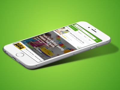
I wanted to create a discovery experience that inspired users by events already occurring in their lives. For example, celebrating a child’s birthday is a yearly event. While a parent may not be specifically looking for birthday activities at the moment, this “collection” will help position Groupon as the place to look when the time comes. Examples of other collections would be, indoor activities, outdoor activities, educational, etc.
The purpose of these collections is to help inspire our users. For those who are stuck and need ideas these new collections will save them some time and make their lives easier.


Event Details
I decided to restructure this deal detail page because I wanted it to be clear and concise. When a user is looking for an event/activity, there is a lot more information required in order to make a decision. I prioritized the key information first such as the event title, date, time, age rating, cost, rating, and location.

Adding key details in the event information such as parking, food, tips helps build credibility. We want to be transparent and list everything the user needs to know so they don’t have to leave our app and do their own research.

The next important piece is the user generated content. Reviews are listed for those who have time to go in detail, but I wanted to a quick and easy summary. The most used keywords are aggregated together, which helps users quickly identify if this event is a good fit.